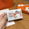
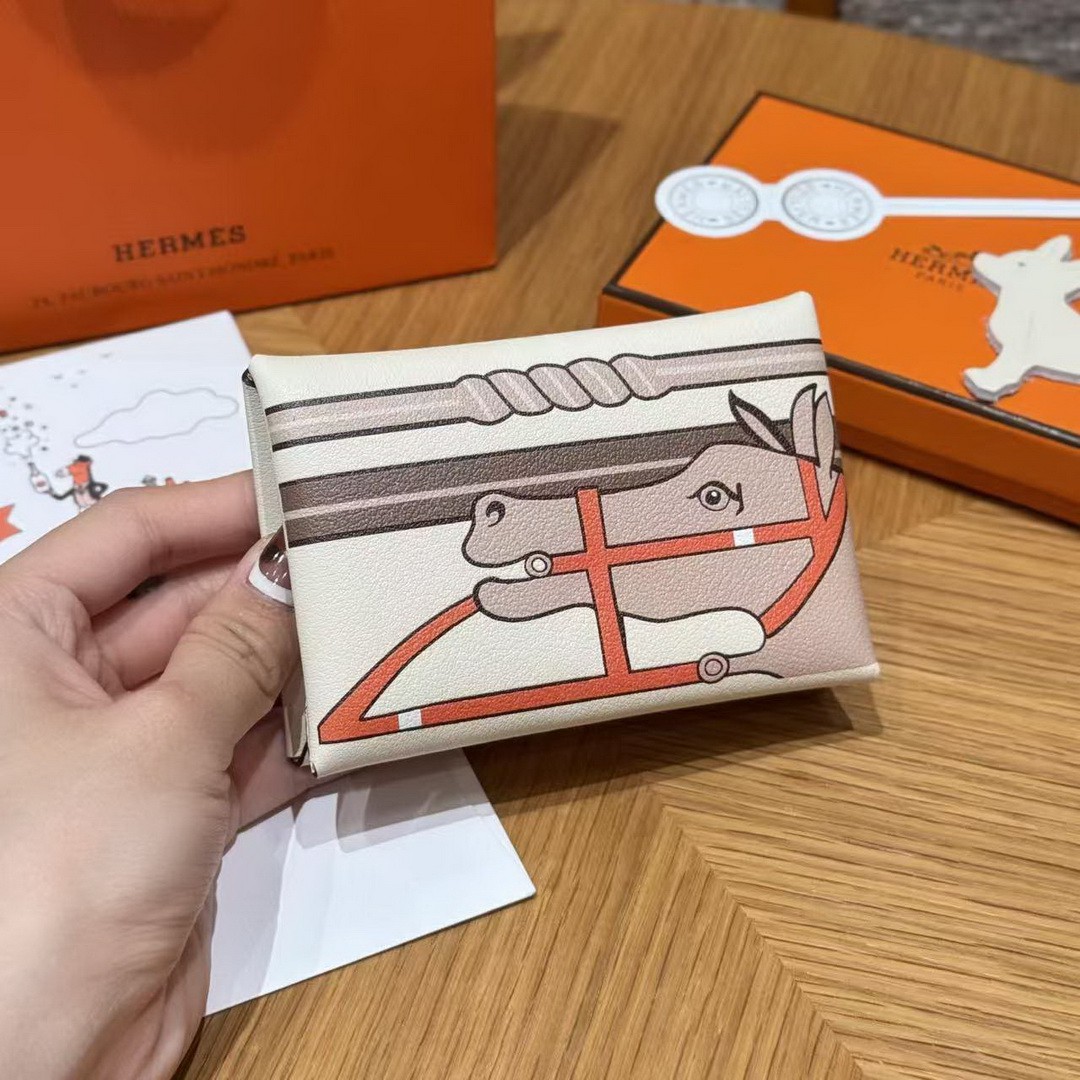
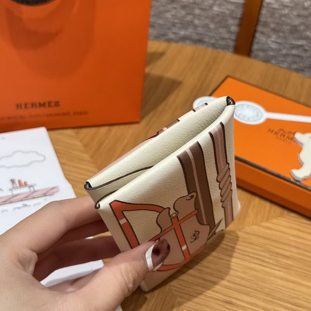
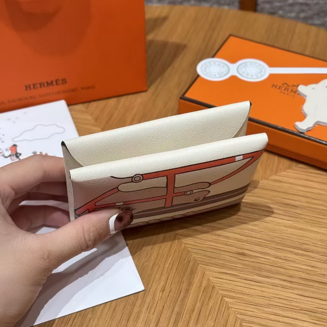
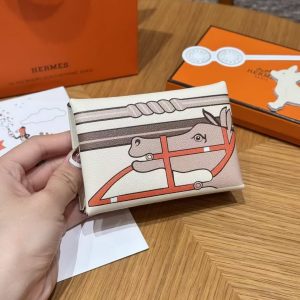
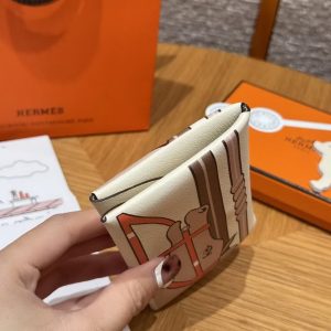

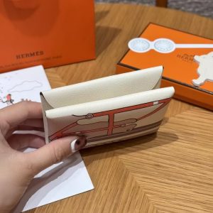
Hermes Calvi Duo Compact Card Holder Handmade In Swift And Chèvre Calfskin Leather I2 Nata
Original price was: $700.00.$79.00Current price is: $79.00.
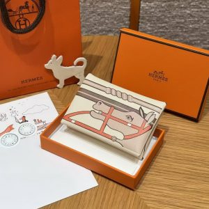
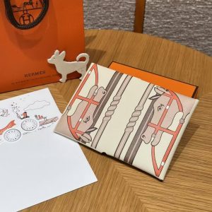
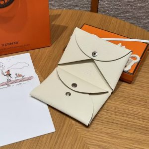
Style: Hermes Calvi Duo Compact Card Holder
Color: I2/ Nata
Size: 7*10*2 CM
Leather: Swift And Chèvre Calfskin Leather
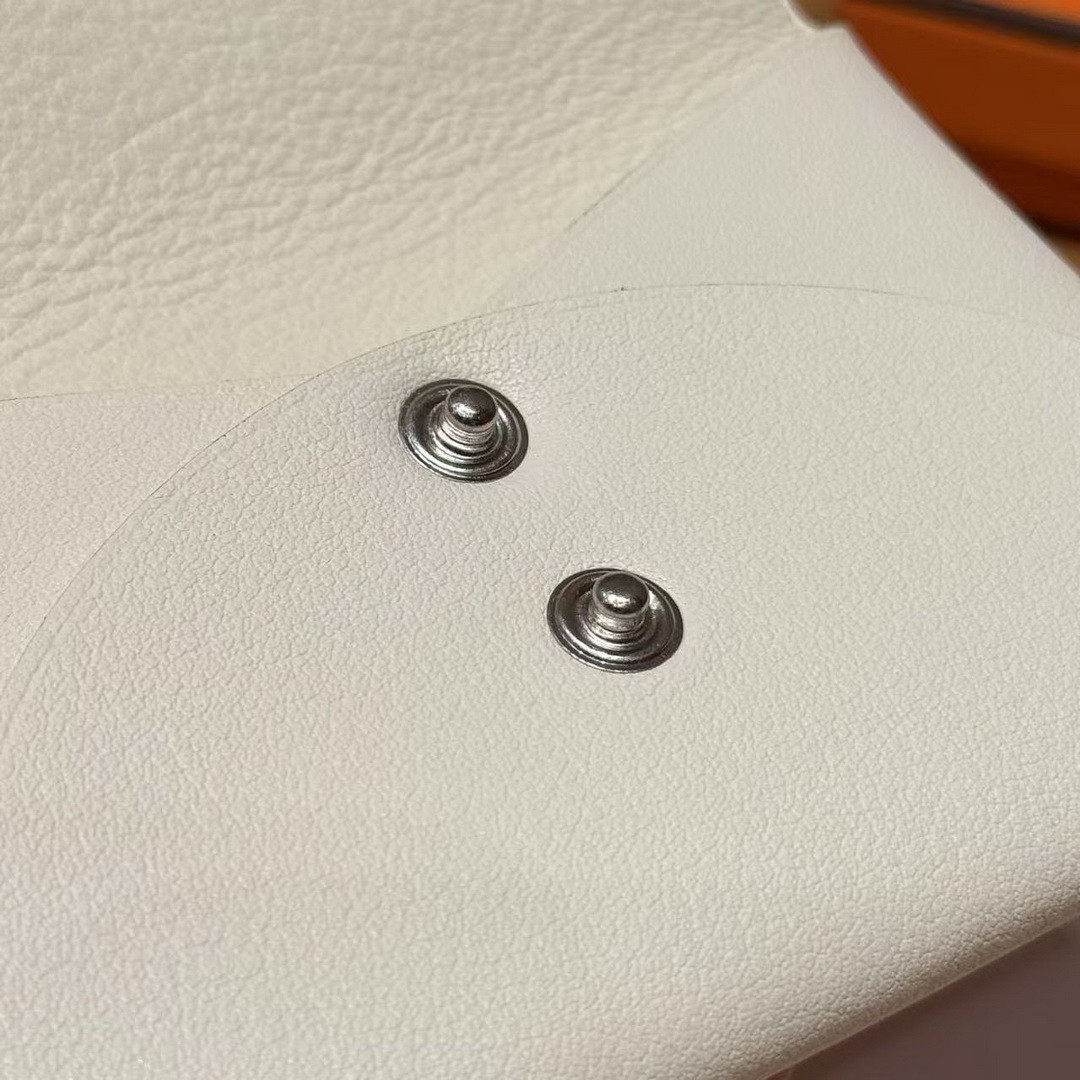
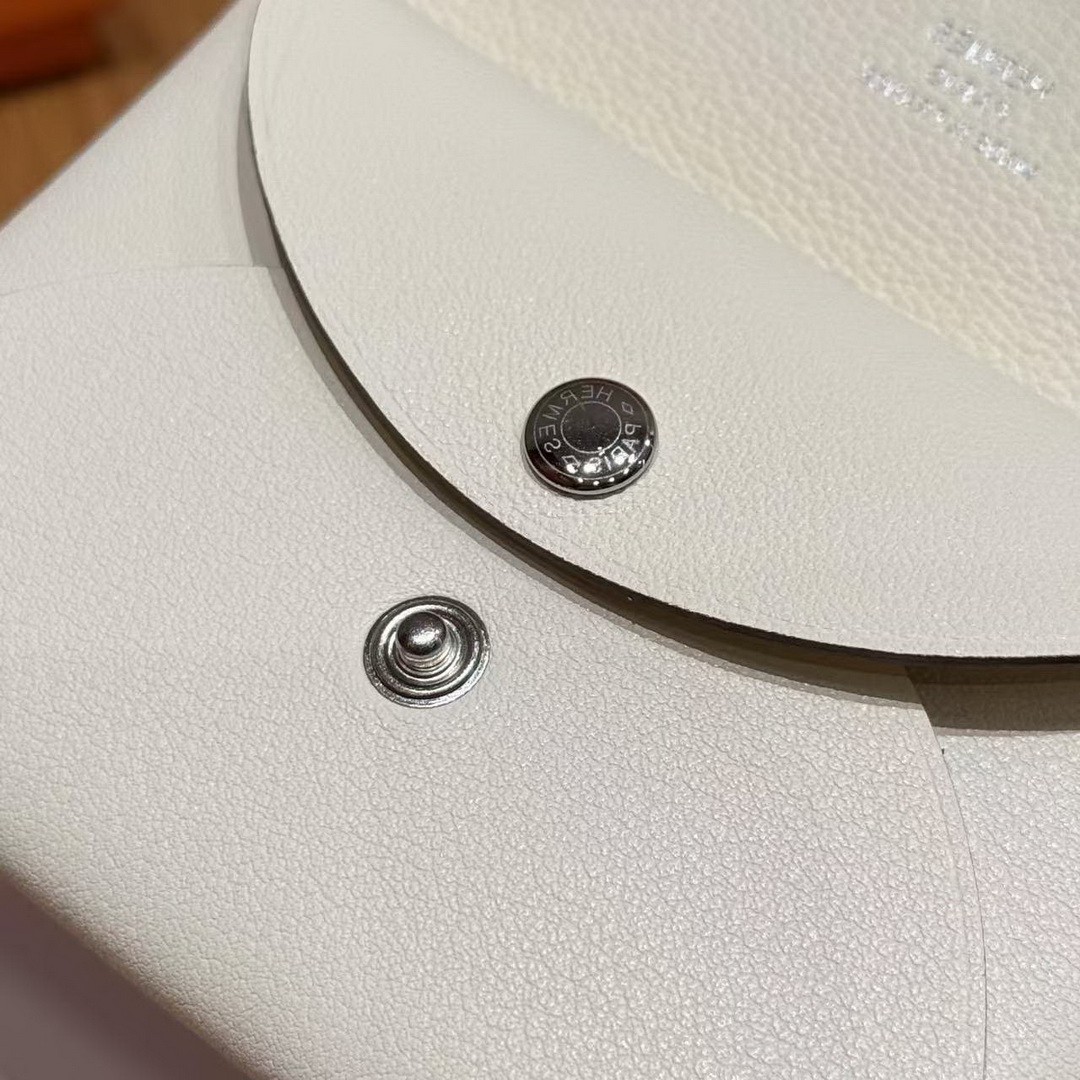
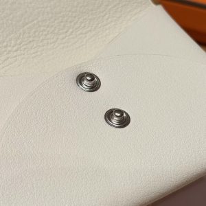
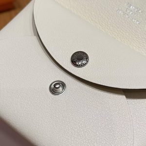
Hardware: Silver
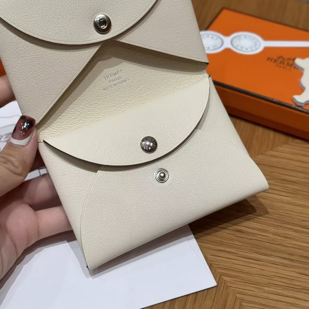
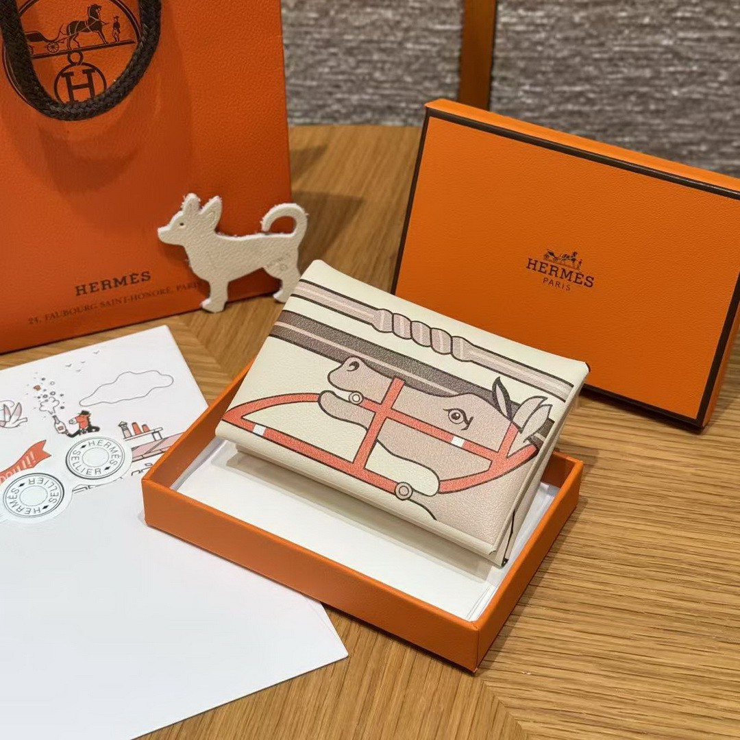
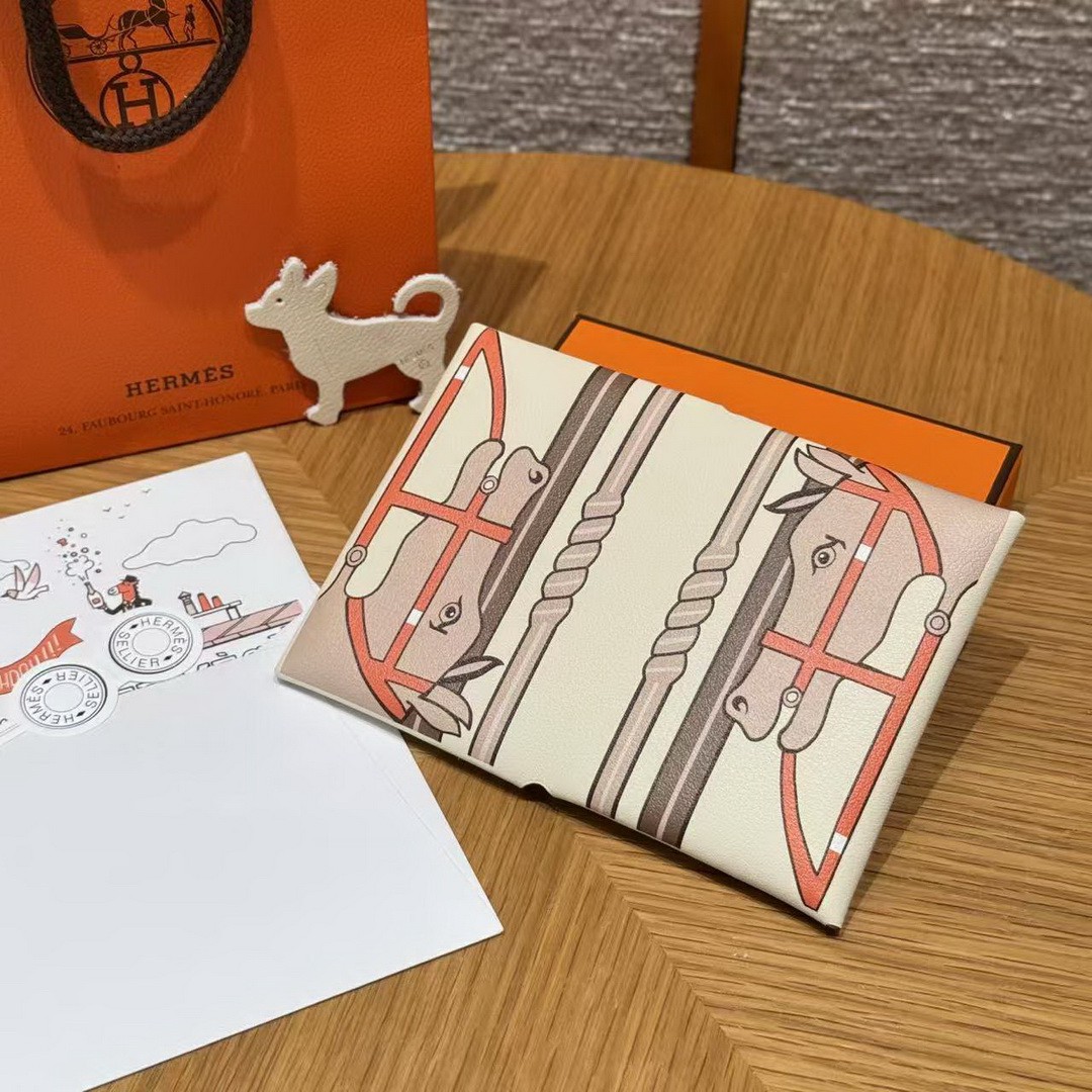
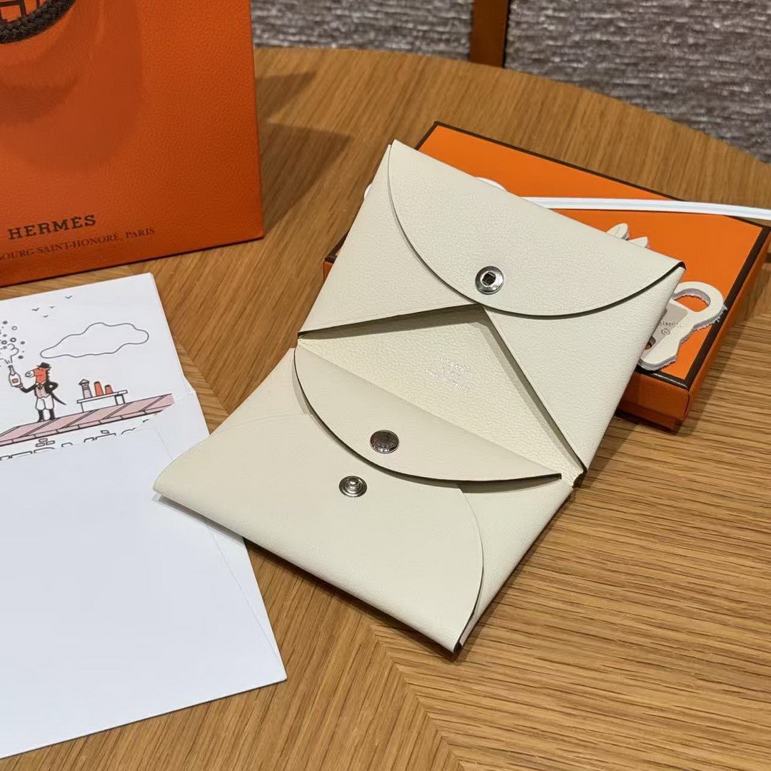
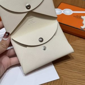
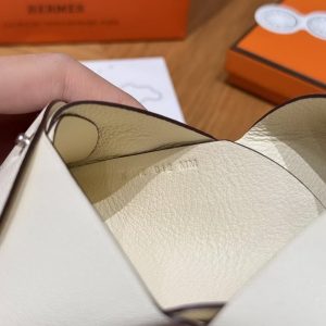
Nata is not white, and that distinction is the first thing to get right. It is a warm, creamy off-white with a hint of oatmeal, the colour of raw silk, and it changes character completely depending on what you set it against.
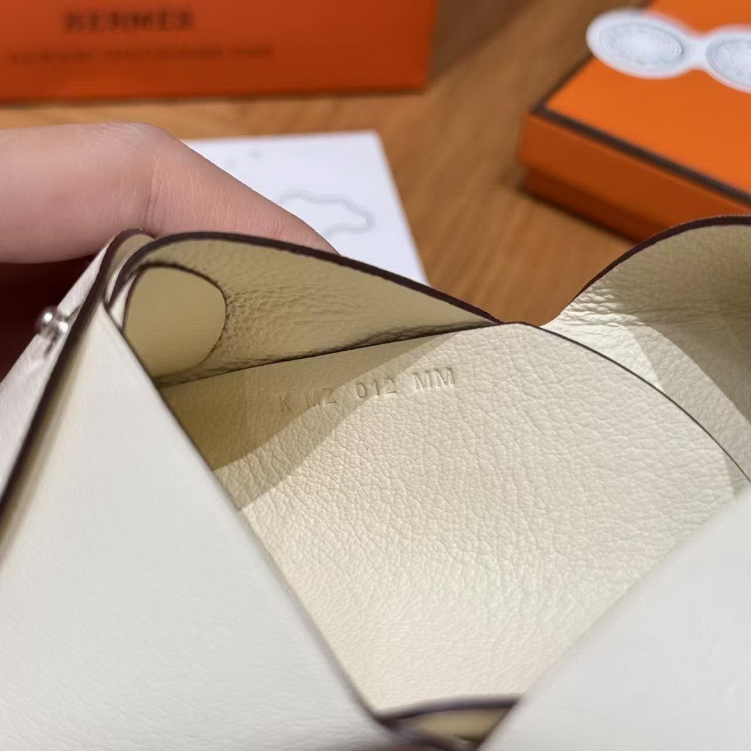
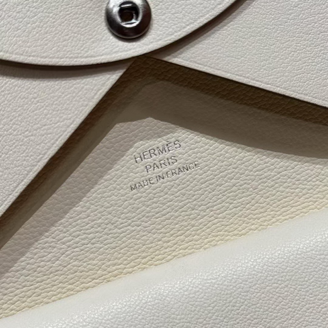
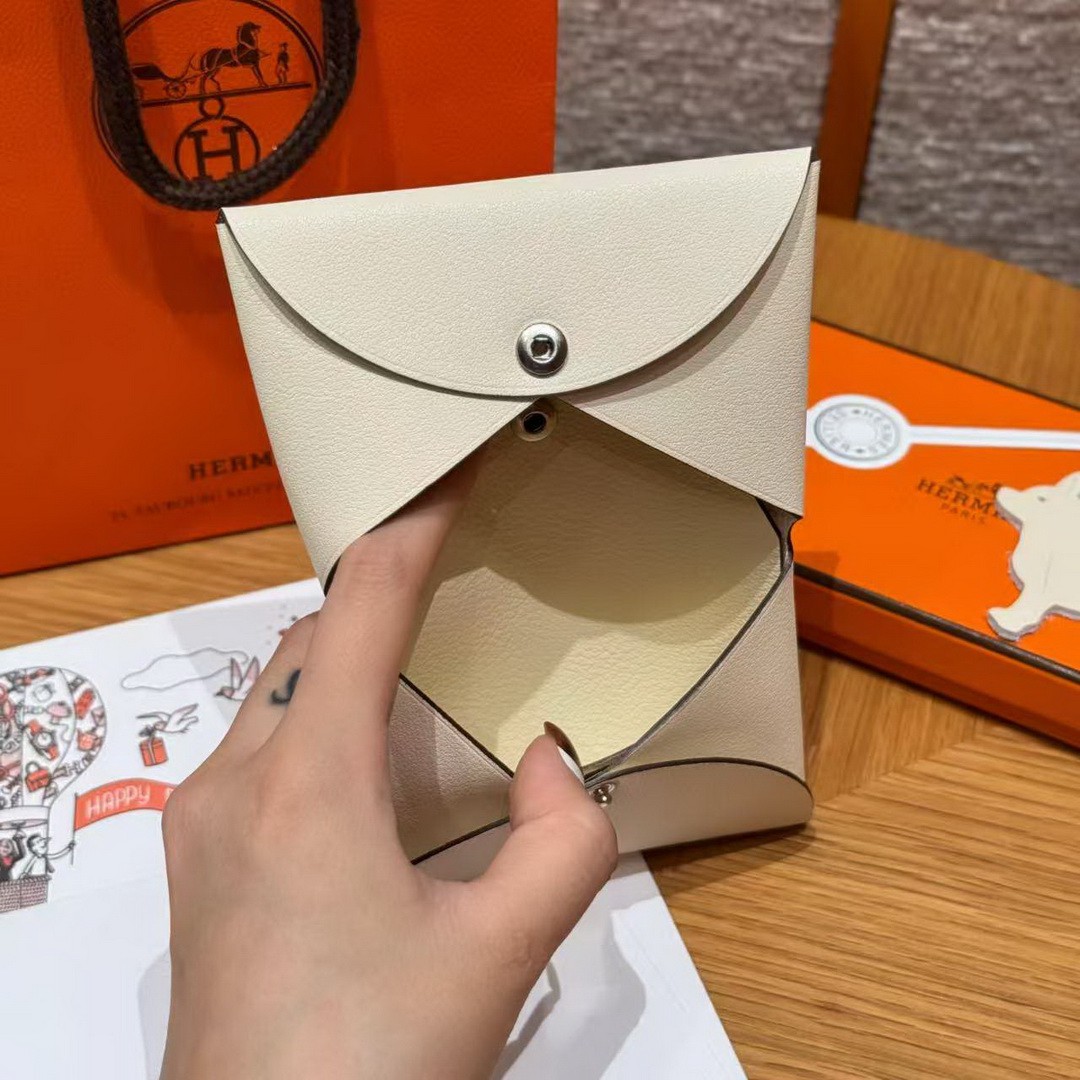
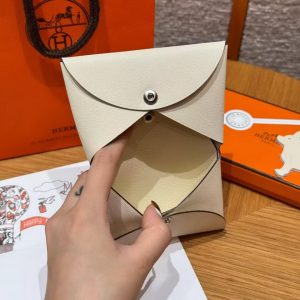
This version pairs Swift on one layer with chèvre on the other – the first fine and matte, the second denser and springier – and in this pale colour the two grains read almost identically. What you notice instead is how firmly it holds its shape with six cards loaded between the sleeves. Loading it is a two-second job, because the sleeves open wide and the leather does not fight your fingers.
I have carried it to two spring weddings and one very long lunch, always in a small shoulder bag, where its ten-by-seven footprint sits flat against the lining and stays put. A folded note, a hotel key card and the day’s essentials fit without bulging the bag’s silhouette.
Trade-off: Nata is kinder about light marks than pure white, but it still wants a pocket of its own. Once it shares space with a set of keys, the smooth Swift face starts showing faint grey smudges that a cloth only partly lifts. I now keep it in a jacket pocket that holds nothing else, and the smudges have stopped multiplying.
Worn against ecru, camel and warm greys it looks like it belongs; against a stark white shirt it reads almost sepia. Know which effect you are buying and it will not disappoint you.
Related products