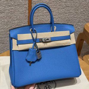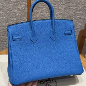

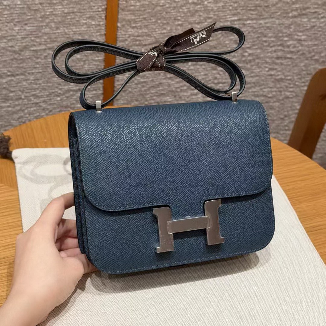
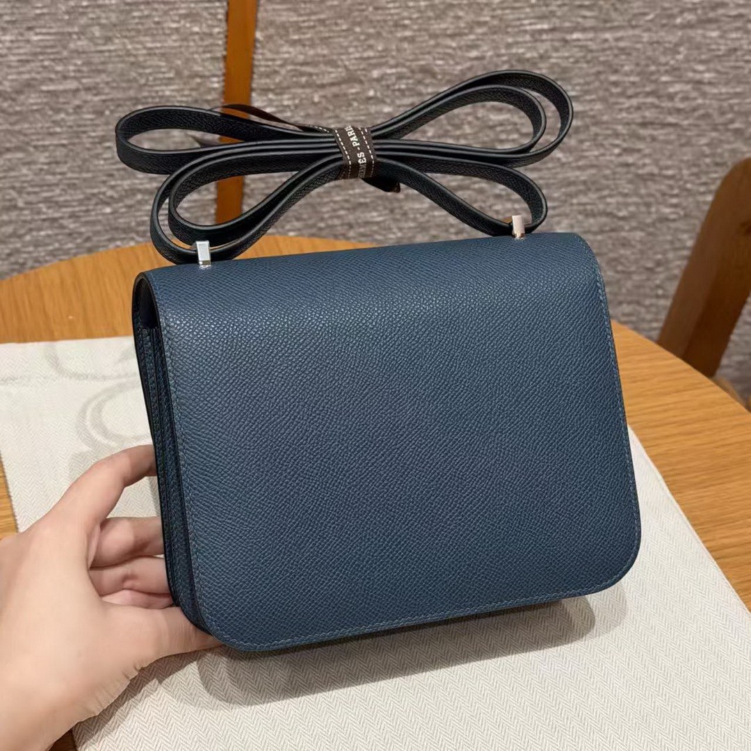
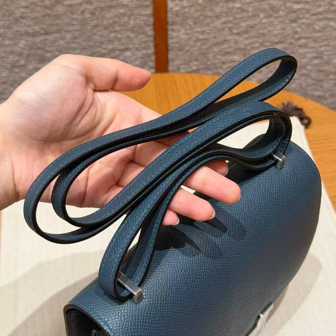
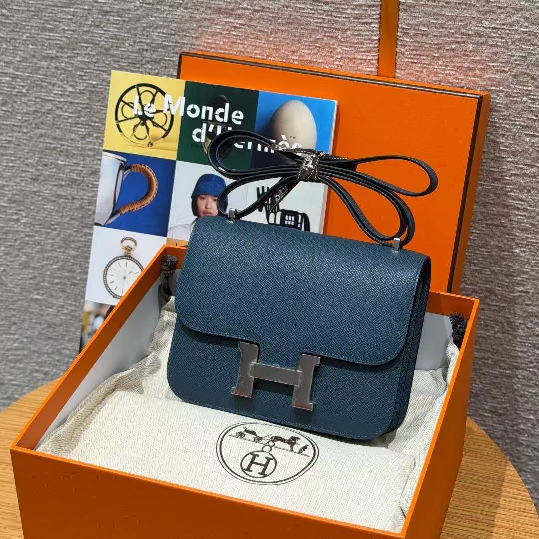
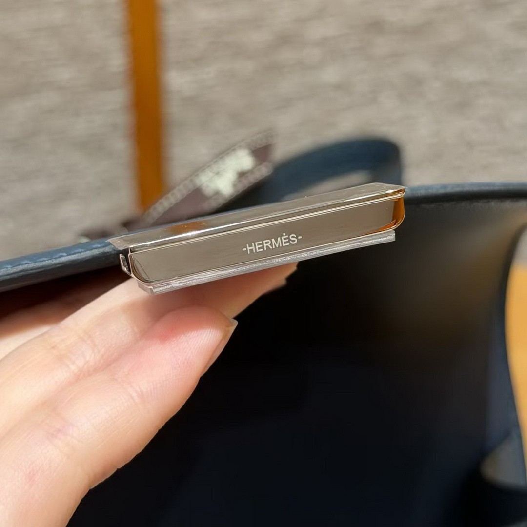
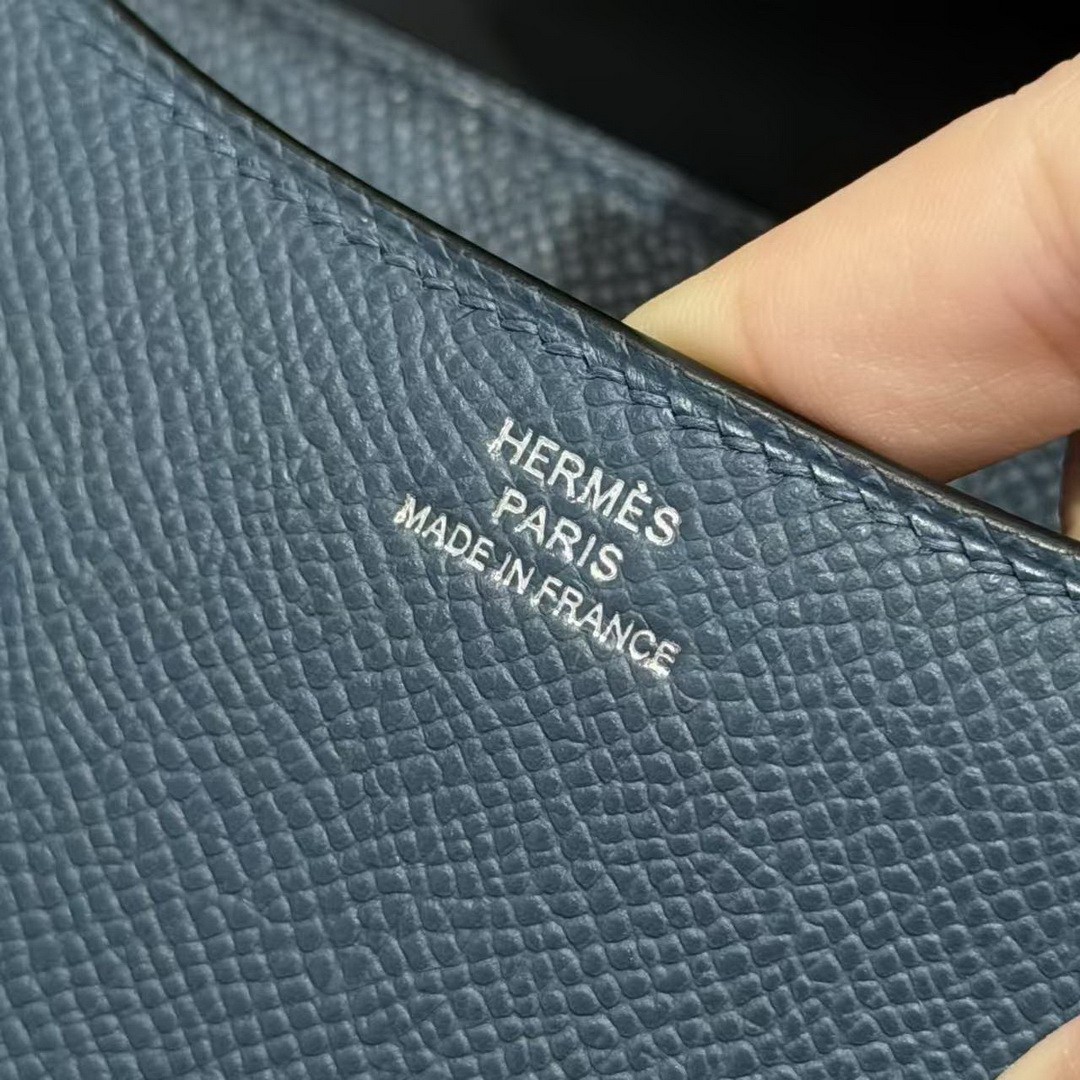
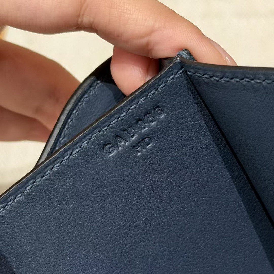
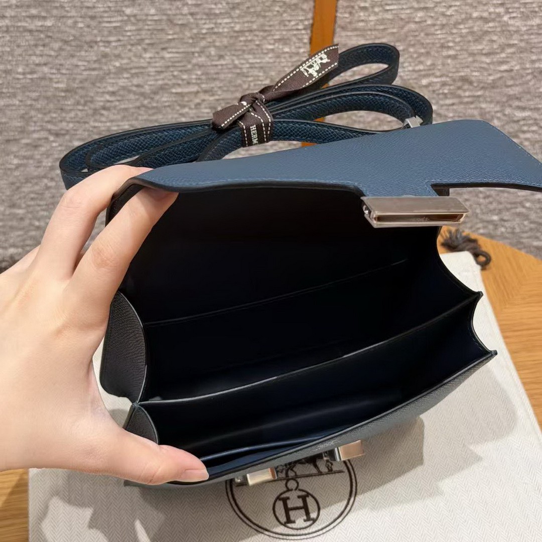
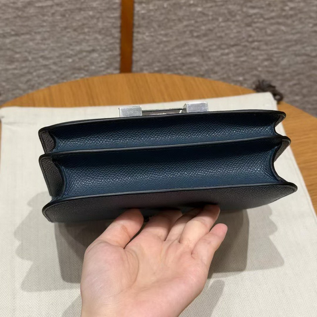
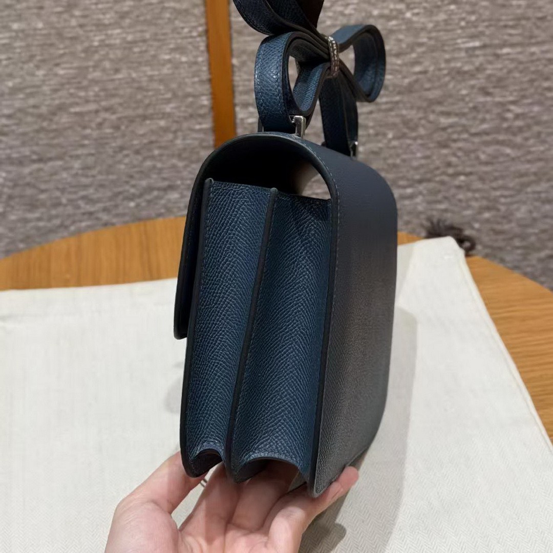
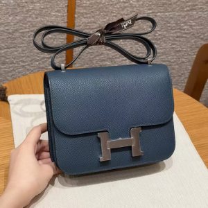
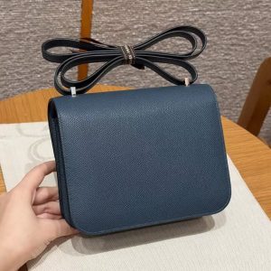
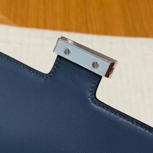
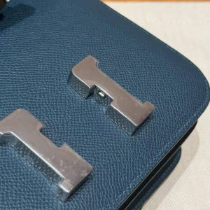
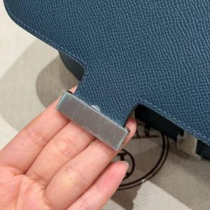
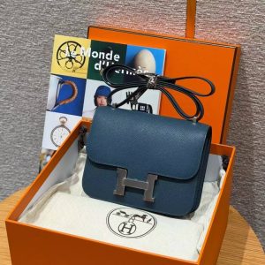
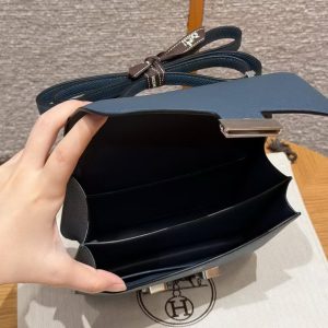
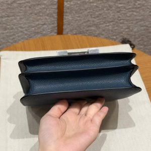
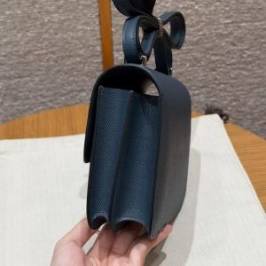
Hermes Constance 18 CM Bag Handmade In Epsom Calfskin Leather Silver Hardware 7P Blue Presse
Original price was: $7,500.00.$799.00Current price is: $799.00.
Style: Constance 19 CM Bag
Color: 7P/ Blue Presse
Size: 18*15*4 cm
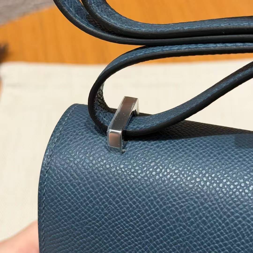
Leather: Epsom Calfskin Leather
Hardware: Sliver
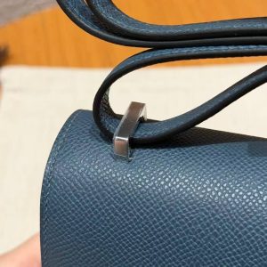
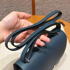
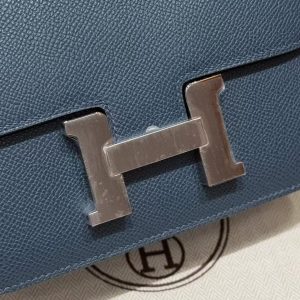
Blue Presse is the opposite of a shy colour: pressed-ink blue, saturated from edge to edge, the shade of a pen that is serious about its job. On the small Constance it does something clever – a deep, vivid blue makes a diminutive bag read bigger, because the eye stays on the colour rather than on the size.
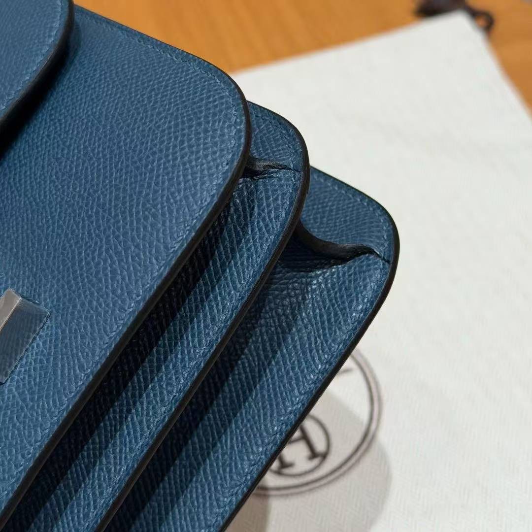
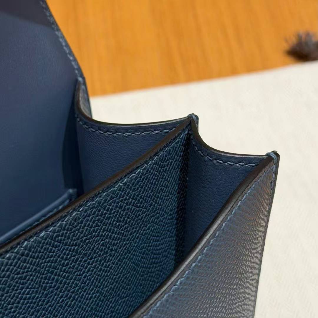
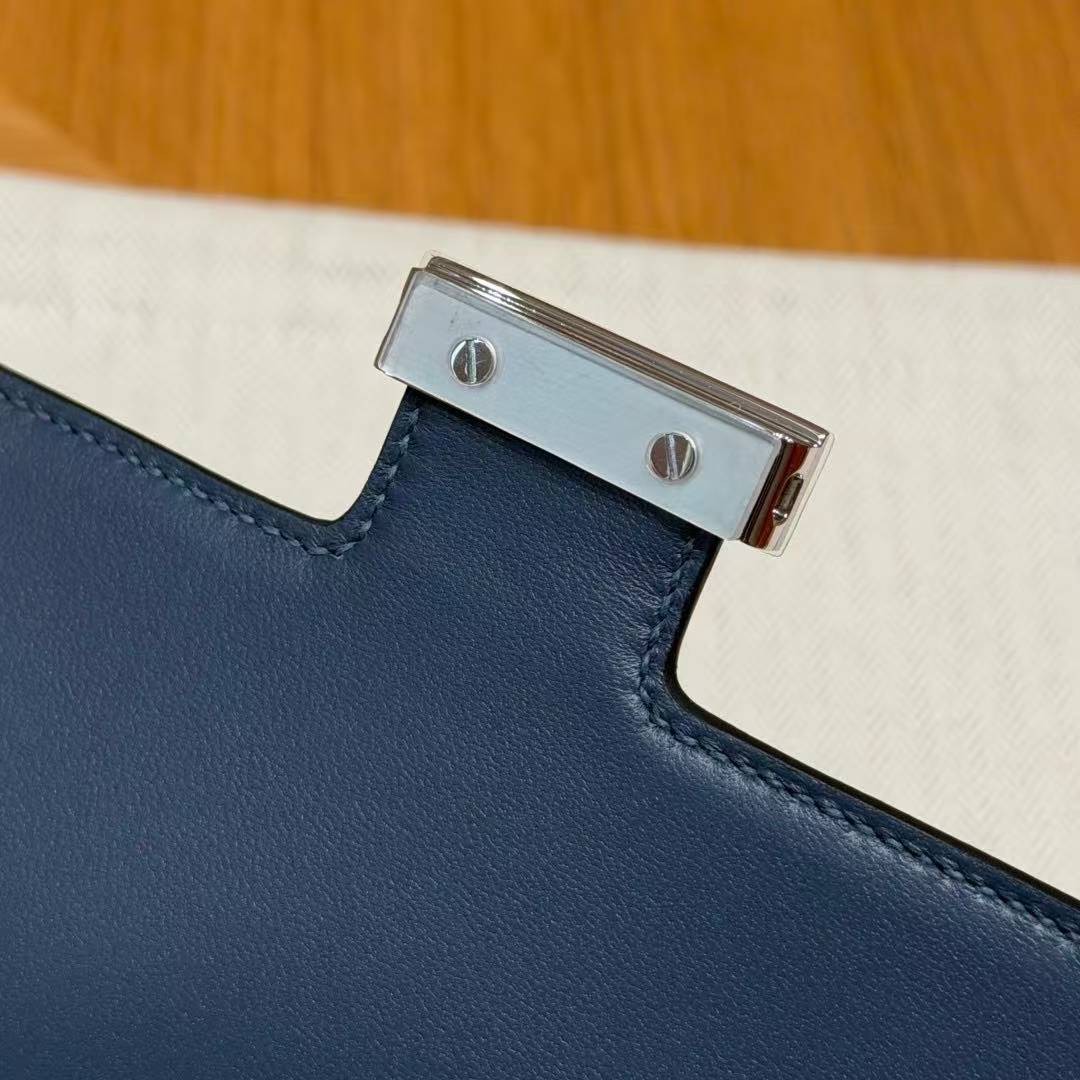
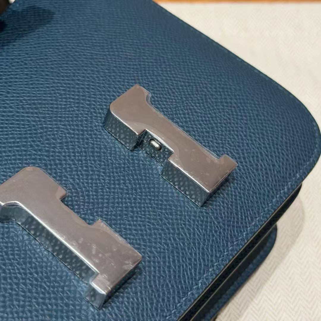
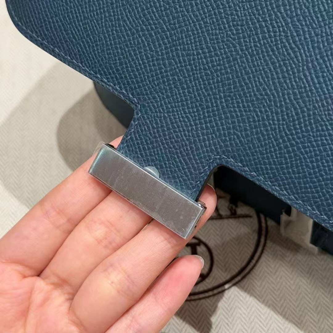
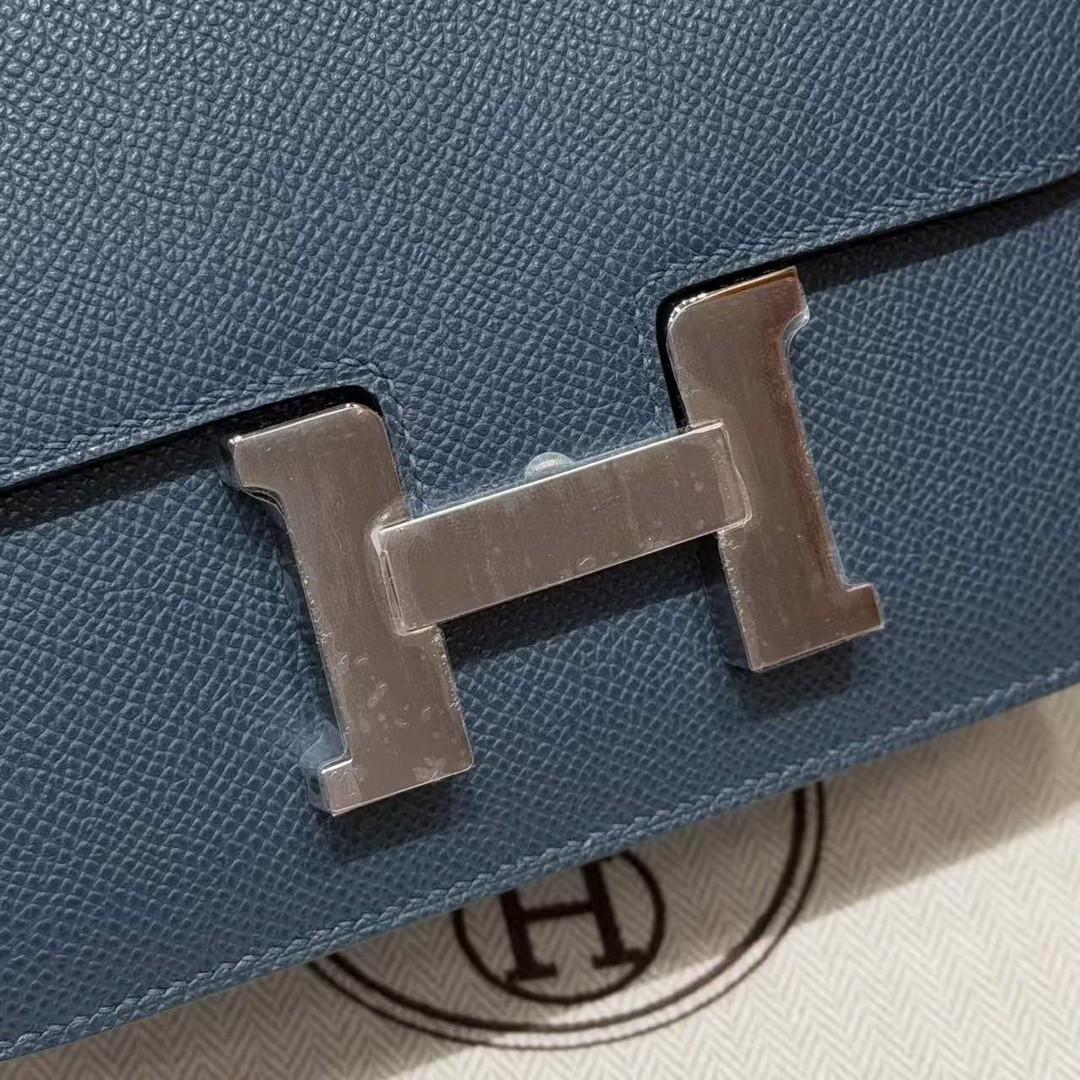
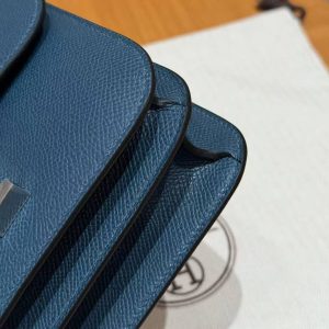
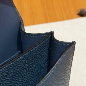
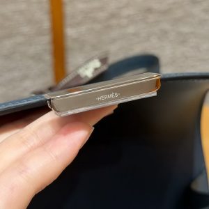
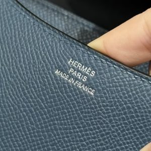
Epsom’s surface is what keeps it graphic. The pressed grain has almost no shine, so there are no highlights breaking up the blue; the bag is one clean block of colour with the silver H sitting in the middle of it. I have handled this shade in softer leathers, and it loses its conviction there – it goes navy-ish and murky. Here it stays crisp.
The practical case is the usual compact one: a phone, keys, my card case, lipstick and a compact mirror, with barely anything stacked. Everything I carry has to earn its place. On my frame it lands at the hip, and the strap keeps it there; the flap closes with a snap you can hear across a quiet room.
One thing worth flagging: a blue this deep is beautiful but slightly formal, and it does not do the casual-summer-bag job that a pastel would. It wants a city. I also find Epsom in dark colours shows dust as a fine film more than lighter shades do – thirty seconds with a microfibre cloth and it is gone. Buy it for a working wardrobe; it will pay you back in every meeting.
Related products